
Page Teaser Configuration
create teasers boxes to promote pages or content
- Page Teaser Boxes for promoting pages
- Content Teaser Boxes for promoting content
- Tombstone Boxes for promoting content
- Exchange Rates Boxes to display current exchange rates
- Box Container & Box Filter Container components
- Comparison Configuration for Box Filter Container components

Content, Tombstone, Exchane Rates and Page Teaser Boxes are used to promote content or pages and are embedded in a page via the components Box Container and Box Filter Container (Page Teasers only). There are several teaser types and their scrolling behaviour can be defined.
Introduction
Page and Content Teaser Boxes, as well as Tombstone and Exchange Rates Boxes go hand in hand with the components Box Container and Box Filter Container (Page Teaser only). As the name of the components state, they are used as containers to display the teaser boxes that are either created as a sub-component (Content Teaser Box, Tombstone Box, Exchange Rates Box) or on the Configuration Page of a Standard Content Page template (Page Teaser Box).
Glossary:
Example:
Box Container with "box Type = narrow" & "scrolling type = overflow"
Box type
The following variety of Box Types are available:
Narrow
- round corners
- outlined
- image above text elements
- up to 4 boxes fit next to each other in main content
Medium
- round corners
- outlined
- image above text elements
- up to 3 boxes fit next to each other in main content
Large
- image as background
- can fit a lot of text content
- dark overlay
- up to 2 boxes fit next to each other in main content
Topic
- no outline
- image above text elements
- up to 4 boxes fit next to each other in main content
Mini
- image as background
- grey/blue overlay
- animated on mouse over
- no link text displayed
- up to 4 boxes fit next to each other in main content
Navigation
- no outline
- headline and subheadline above image
- used in main navigation dropdown in the Header navigation configuration page template
Row
- no outline
- headline and subheadline next to image
- uses full main content width
- only available in the component Box Filter Container
Scrolling type
The scrolling type can't be set in the teaser itself, but in its container component. It defines the way how the teasers are arranged in the front-end, if the amount of boxes in one line exceed the maximum amount of displayable boxes in one line. For example if the box type is set to narrow, up to 4 boxes can be displayed in one line. All exceeding boxes are either in a new line (scrolling type = none), or hidden on the right side of the main content (scrolling type = overflow, fixed).
The following variety of scrolling types are available:
Fixed
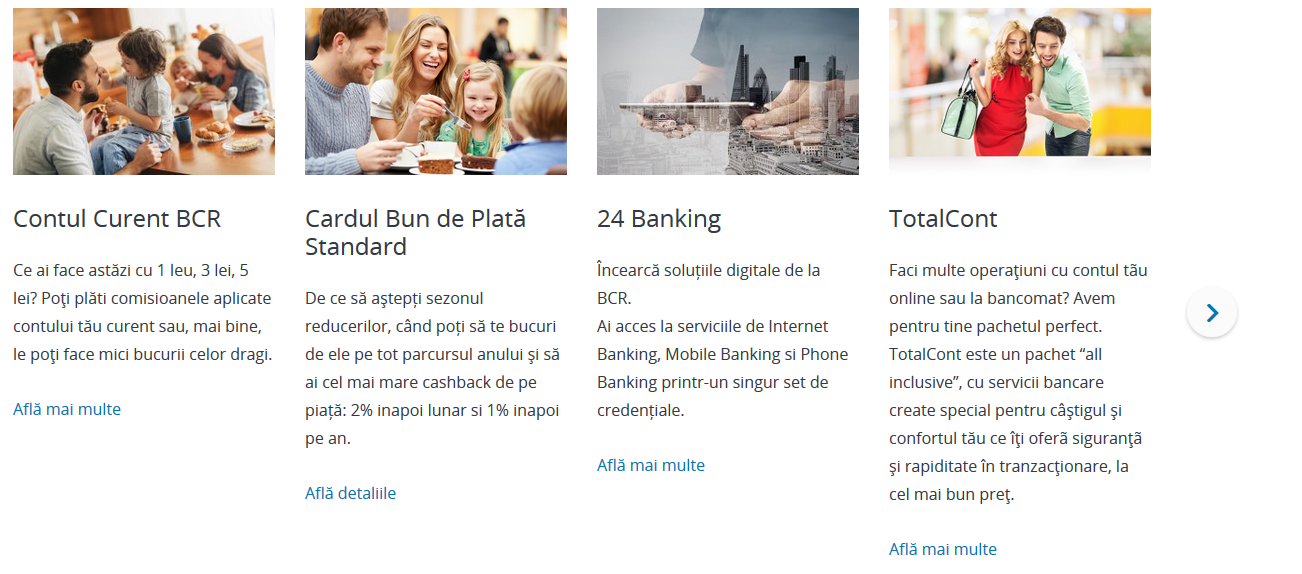
With a "scrolling type = fixed", an arrow on the right side indicates the exceeding teaser boxes.
Overflow
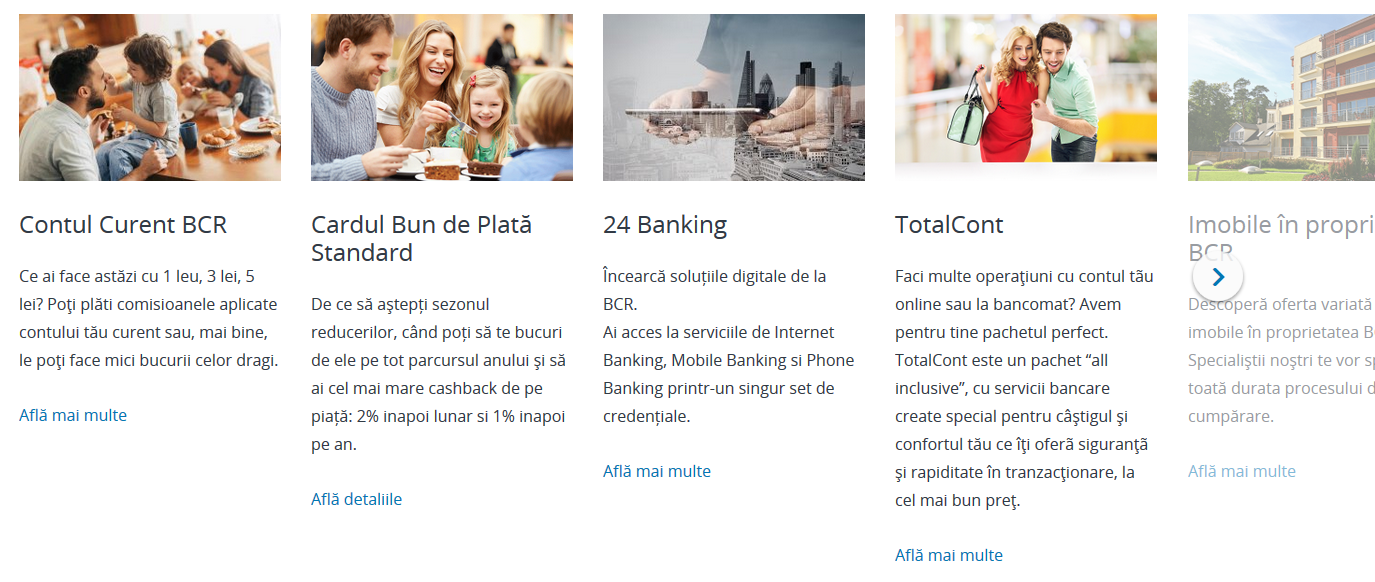
With a Scrolling Type = Overflow, an arrow and a blurred teaser box on the right side indicate the exceeding teaser boxes.
None

With a Scrolling Type = None, all teaser boxes are floating next to each other and are displayed on a new line, if the available space on a line is reached.
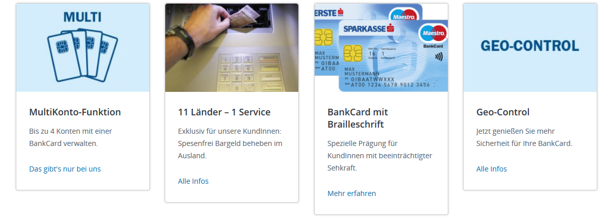
Tombstone Box
Tombstone boxes are also used for boxes, that shall not be re-used, have no link and are therefore only available on the page where they are created. A use case could be to create a box that promotes a product or a topic that has no specific content page.
These boxes are thus not created in the (Teaser) Configuration Page of a Standard Content Page template but as a sub-component of a Box Container component.
tab: Logo
tab: General
Exchange Rates Box
Exchange Rates boxes are also used to display an exchange rates table and are therefore only available on the page where they are created.
These boxes are thus not created in the (Teaser) Configuration Page of a Standard Content Page template but as a sub-component of a Box Container component.
tab: General
tab: Currencies
tab: Columns
tab: Link
Comparison Configuration
If the Comparison feature is used in a Box Filter Container, the values of what acutally gets compared with this box must be set here. Beforehand, the Comparison Set must be configured in the Comparison Sets Configuration Page. This set is then available in the Comparison Set dropdown and displays the Comparison Fields. These fields must then be filled in for every box that shall be available for Comparison.
To add a Comparison Configuration to the Page Teaser Configuration, simply drag'n'drop the component from the sidekick to the only available drop field on the very bottom of the page.
Please see the Box Filter Container Comparison feature help pages for more detailed information.
In the Author (non-edit mode), the component is displayed as follows:
Related topics
Used recurring elements
Help Center
Important links:

Topics:
- , Opens in a modal
- , Opens in a modal
- , Opens in a modal