Common Form components

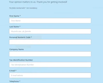
An overview of all components in the Common Forms component group, available in a Modal Content Page.

Confirmation component

(aka Thank You Page)
in Common Forms

used to create the Thank You Page after form submission

Date component
in Common Forms

  • creates a date input field
  • multiple Display Modes
  • date picker
  • configurable format
  • configurable date range

Disclaimer component
in Common Forms

  • creates an overlay that must be confirmed before displaying a page
  • sets a session cookie to only display the Disclaimer once
  • multiple options to define confirmation behaviour

Form component
in Common Forms

  • main container component to configure a form
  • set Action Type on submit
  • define form layout / style
  • e-mails configuration
  • define Next Step Page

Form Headline component
in Common Forms

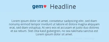
The Form Headline component is used to create a headline for any form. It can contain an image, a headline and a sub-headline.

Label component
in Common Forms

The Label component is used to create additional labels inside a Form component. It is created using a Rich Text Editor to adapt its appearance and also has different constraint options available.

Numeric Field component
in Common Forms

The Numeric Field component is used to create input fields and sliders for numbers. There are several styling options to adapt its appearance and also different constraint options.

OIB component
in Common Forms

The OIB component is used to create input fields for the croatian personal ID numbers (Osobni identifikacijski broj or OIB), that are assigned by the Tax Administration. There are different constraint options and an automatic check to see if the entered number is a valid OIB.

Opt-In component
in Common Forms

The Opt-In component is used to create an text with a checkbox that are used to accept certain conditions or terms and also sets a cookie upon clicking on a Submit component to remember if they were accepted.

Rating component
in Common Forms

The Rating component is used to create a rating field inside a Form component. There are two different stylings to adapt its appearance and also different constraint options.

Reset component
in Common Forms

The Reset component is used to reset a Form to its original state. All previously made entries are deleted and set to the default state. There are different button stylings and alignments to adapt its appearance and also different constraint options.

Selection component
in Common Forms

The Selection component is used to create dropdowns, buttons, checkboxes and radio buttons inside a Form component. There are several stylings to adapt its appearance and also different constraint options.

Submit component
in Common Forms

The Submit component is used to submit a Form and send it via Email, or to go to the next page of a longer Form. There are different button stylings and alignments to adapt its appearance and also different constraint options.

Text component
in Common Forms

The Text component is used to create a text input field inside a Form component. There are several styling to adapt its appearance and also different constraint options.

Upload component
in Common Forms

The Upload component is used to create a file upload field inside a Form component. There are several file extensions that are allowed and also different constraint options.

Recurring Form Component Elements: Constraints
in Common Forms
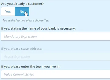
Element that is used in Form components to add a behaviour or display restriction or change to a component

  • Mandatory Expression
  • Visibility Expression
  • Access Expression
  • Value Commit Script
  • Positive Reinforcement

Recurring Component Elements: Style
in Common Forms

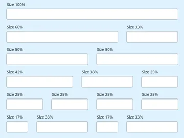
Style element that is used in all Form components to define the width of components.