
Table Component
create a table to display and organize data
- adjustable table sizes
- editing in Rich Text Editor or HTML

Present data in an organized way to give a better understanding.
Introduction
The Table component provides an easy way to organize data. Rows and columns can be freely added or removed to adjust the table size and even single cell properties can be adjusted. Editing is possible in either the Rich Text Editor or for a more customizable table in HTML. There is also a small variety of styling options available.
Glossary:
Example:
CMS settings
tab: Table
| Rich Text Editor | Common RTE element to add textual content. Optional. jump to example |
|---|
In the Table tab, the actual table is created and filled with data, via a Rich Text Editor or HTML.
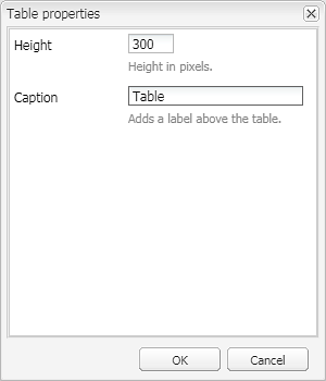
By right clicking on the table either the table or cell properties can be set or a nested table can be created.
 |
Table Properties | Creates a new table or edits the properties of an existing one
Caption: adds a caption to the table |
|||
 |
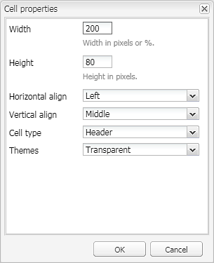
Cell Properties | Edit the properties of a marked cell
Width: assignes a fixed width to the cell (cells underneath this one will also be adjusted) Height: assignes a fixed height to the cell (cells next to this one will also be adjusted) Horizontal Align: defines how the text inside the cell should be aligned horizontally. Available options are:
Vertical Align: defines how the text inside the cell should be aligned vertically. Available options are:
Cell Type: defines a type for the cell, that changes the text styling. This is inherited by cells that are added afterwards. Available options are:
Theme: defines a Theme for the cell. Available options are:
|
|||
|
Insert Above | Insert a new row above the current row | |||
 |
Insert Below | Insert a new row below the current row | |||
 |
Delete Row | Delete the current row | |||
 |
Insert Left | Insert a new column to the left of the current column | |||
 |
Insert Right | Insert a new column to the right of the current column | |||
 |
Delete Column | Delete the current column | |||
 |
Bold | Makes the selected text bold. Example: bold text |
|||
 |
Italic | Makes the selected text italic. Example: italic text |
|||
 |
Underline | Underlines the selected text. Example: underlined text |
|||
 |
Align text left | Aligns the selected text left. Example: left aligned text |
|||
 |
Align text center | Aligns the selected text center. Example: center aligned text |
|||
 |
Align text right | Aligns the selected text right. Example: right aligned text |
|||
 |
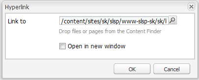
Hyperlink | Adds a link to the selected text
Example: hyperlinked text |
|||
 |
Unlink | Removes a previously created link |
|||
 |
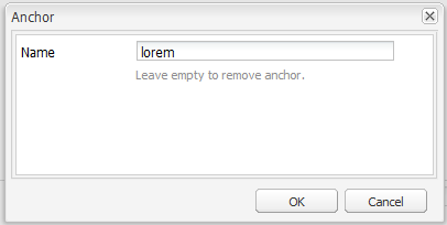
Anchor | Adds an anchor to the selected text
A set anchor can be linked to by adding a # in front of it. So if an anchor on the same page is linked to, it is sufficient to create a Link component or a hyperlink in the RTE and add #example-anchor as link target. If an anchor on another page is linked to, enter the full URL like: http://www.sparkasse.at/horn/privatkunden#example-anchor Example: link to a set anchor (which is this table list item) |
|||
 |
Bullet list | Adds a bullet list. Example:
|
|||
 |
Numbered list | Adds a numbered list. Example:
|
|||
 |
Outdent | Outdents the selected paragraph or list item. Example: outdented text |
|||
 |
Indent | Indents the selected paragraph or list item. | |||
 |
Source edit | Allows to edit the text in HTML
Only common HTML attributes are valid, all <script> information will be discarded.
|

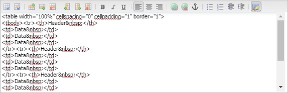
 Please note that only HTML experienced editors should use this feature. Bugs or defects that result from invalid HTML can not be supported by the Helpdesk.
 tab: Style
In the Style tab, a small selection of styling choices are available.
The table theme and alignment can be choosen, as well as wether the first row or first column should be sticky or if the table should have a fixed layout, a horizontal line on top, a smaller font or wether to hide this table on a mobile device.
| Theme | Common Theme element to add a background color to the component. Mandatory. |
|---|---|
| Hide on mobile | If checked, the table will not be displayed on a mobile device. Optional. jump to example |
| Sticky first row | If selected this option makes the first row of the table stick to the top of the browser and follows the scrolling down the page behaviour of a visitor making the information visible until the end of the table. Optional. jump to example |
| Sticky first column | If selected this option makes the first column of the table stick to the side of the table and follows the scrolling to the side behaviour of a visitor making the information visible until the end of the table. Optional. jump to example |
| Vertical alignment | Defines how the text is aligned vertically. Mandatory.
Available options:
|
| Fixed table layout | If checked, column sizes will be automatically adjusted to fit all of the table onto the page or component, so no scroll bars have to be used. Optional. jump to example |
| Display horizontal line | If checked, a fine horizontal line will be displayed on top of the table. Optional. jump to example |
| Small Header Font | If checked, all cells with the type Header will have a smaller font size. Optional. jump to example |
| Small Content Font | If checked, all cells with the type Data will have a smaller font size. Optional. jump to example |
tab: Spacing
Front-end examples
Example: Hidden on mobile
Step by step
1
2
3
Related topics
Used recurring elements
Help Center
Important links:

Topics:
- , Opens in a modal
- , Opens in a modal
- , Opens in a modal